Is Your Edmonton Website Outdated? Modern Website Design Can Save You
by Aaron Janes, Founder

Let's imagine a potential customer in Edmonton is searching for a "coffee shop near me" on their phone. They click on your website link, excited for a caffeine fix. But then... BAM! They're hit with a wall of outdated graphics, clunky menus, and text that's harder to read than a faded chalkboard.
I'm talking something like this.
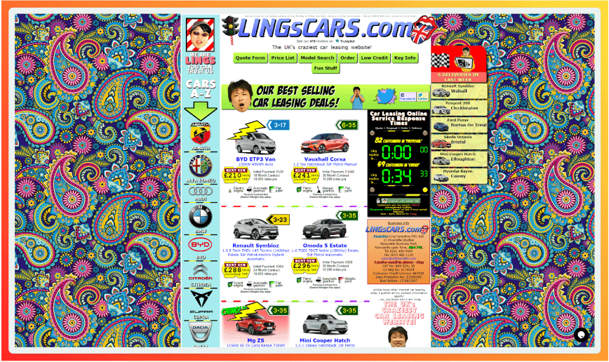
Now, if that's your niche and approach, great. No doubt it's super creative. However, most people are looking for something grounded, functional, and serving them easily. They want what they want quickly and without stress.
Have a website that gives them stress or confuses them, even slightly, and they'll bounce away to a competitor. Statistics show this usually happens within 0.50 milliseconds, so you've got to make it count.
Otherwise, you could be losing serious business.
In this guide, I'm walking you through the world of modern website design, exploring what it is, what factors are involved, and how you can use it to attract more customers, build trust, and boost your bottom line in the Edmonton market.
Let's get into it.
Signs Your Website Needs a Modern Makeover
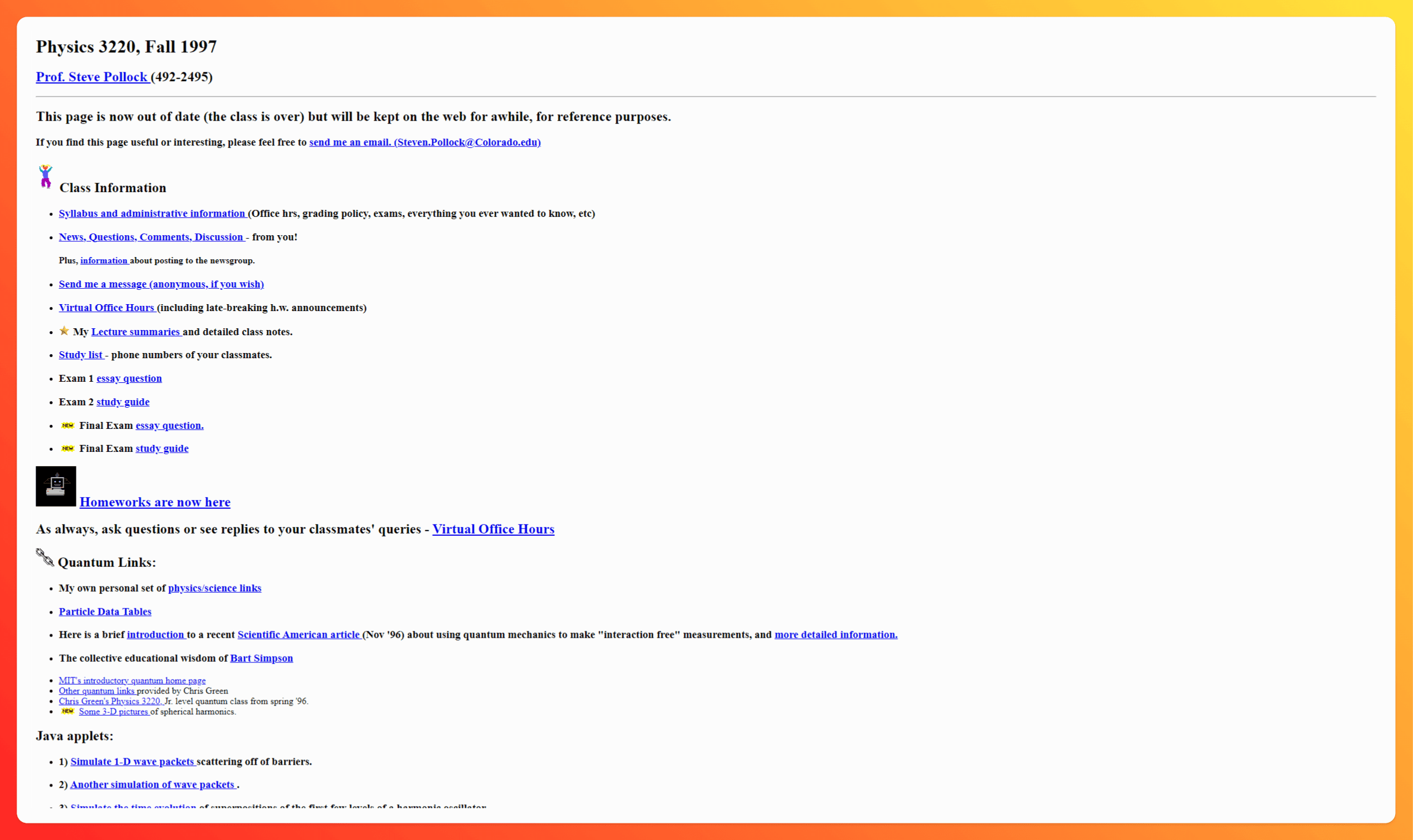
Now, you might be thinking, "Ignite, my website is perfectly fine!" But trust me, even the most well-intentioned websites can fall victim to the sands of time. Here are a few telltale signs that your online presence might need a little refresh:
Visual cues your website is outdated
- Stuck in a time warp: Does your website still rock those flashy animations from the early 2000s? Or maybe it's got that classic "table-based" layout that screams "dial-up internet"? If your design aesthetic is giving off vintage vibes (and not in a good way), it's time for an update.
- Cluttered and confusing: Is your website a chaotic maze of text, images, and buttons? If visitors can't find what they're looking for quickly and easily, they'll likely bounce faster than a hockey puck on ice.
- Image quality that's pixelated perfection (not!): Blurry, pixelated, or amateur-looking images can seriously damage your credibility. Remember, in the visual age, high-quality photos and graphics are a must.
- Mobile? What mobile?: In a world dominated by smartphones, a website that doesn't function flawlessly on mobile devices is a major no-no. If your site looks like a zoomed-out desktop version on a phone, you're alienating a huge chunk of potential customers.
Technical issues that scream "outdated"
- Snail-paced loading speed: Did you know that 40% of people abandon a website that takes more than 3 seconds to load? In our fast-paced world, nobody has time to wait for a slow website.
- Broken links and 404 errors: Stumbling upon a broken link is like hitting a dead end. It's frustrating for users and makes your website look unprofessional.
- Security? What security?: If your website address doesn't start with "HTTPS," it's like leaving your front door wide open. A secure website is essential for protecting your customers' data and building trust.
- SEO? Is that a type of pasta?: If you haven't optimized your website for search engines, you're making it invisible to potential customers. Modern websites are built with SEO in mind from the ground up.
Content woes that need to go
- Thin and outdated content: Is your website content as dry as a hockey rink in July? Engaging, informative, and up-to-date content is crucial for keeping visitors interested and establishing your expertise.
- Typos that make you look like an amateur: Typos and grammatical errors are like red flags for unprofessionalism. Always proofread your content carefully (or, better yet, hire a professional editor!).
- No clear call to action: What do you want visitors to do on your website? Make it crystal clear with strong calls to action that encourage them to contact you, make a purchase, or learn more.
- Keyword stuffing and spammy tactics: Trying to trick search engines with shady SEO tactics will backfire. Modern websites focus on providing genuine value to users, not just stuffing keywords into every nook and cranny.
If any of these signs sound familiar, don't panic! It's time to roll up our sleeves and give your website the modern makeover it deserves.
Why Modern Website Design Matters for Edmonton Businesses

Okay, so maybe you've spotted a few cobwebs on your website. But is a modern redesign really that important? In a word, YES!
Here in Edmonton, where the business landscape is as dynamic and diverse as our city itself, a modern website can be the difference between thriving and just surviving.
First impressions are everything
Again, first impressions are everything, and I can't stress this enough.
Just like when you browse the internet or go into a physical store, you're constantly judging what's on offer and forming an opinion as to whether or not this is the best place for you.
We all do this either consciously or unconsciously.
It's like walking past a fancy restaurant when you're looking for someplace to eat and feel it will either be too expensive, too fancy, the portion sizes too small, or you're not dressed up enough.
All opinions you make in a split second. Your website is the restaurant, and your customers are walking past. What do they think?
A sleek, modern website makes a strong first impression, conveying professionalism, credibility, and attention to detail.
On the flip side, an outdated website can make your business seem out of touch, untrustworthy, or even incompetent.
Building trust and credibility
Consumers are savvy these days.
They can sniff out a phony website from a mile away. A modern website, with its clean design, clear messaging, and user-friendly interface, signals that you're a legitimate business that takes pride in its online presence.
This builds trust and encourages visitors to engage with your brand.
Enhanced user experience
Nobody wants to wrestle with a website that's slow, confusing, or difficult to navigate. A modern website prioritizes user experience, offering smooth navigation, clear calls to action, and easily accessible information.
A positive user experience keeps visitors on your site longer, increasing their chances of converting into customers.
Improved SEO performance
Want to rank higher in Google search results? A modern website is your ticket to the top. Search engines love fast websites, are mobile-friendly, and have clean code.
Plus, a modern design often goes hand-in-hand with fresh, relevant content, another key factor for SEO success.
Increased conversions
Ultimately, your website is a tool for driving business results. Whether you want to generate leads, boost online sales, or encourage appointment bookings, a modern website can help you achieve your goals.
By providing a seamless user experience, showcasing your products or services effectively, and guiding visitors toward conversion points, a modern design can significantly increase your conversion rates.
Competitive advantage
Edmonton's business scene is competitive. To stand out from the crowd, you need a website that captures attention and showcases your unique value proposition.
A modern website gives you a competitive edge, making you look more professional, credible, and appealing to potential customers.
Key Elements of Modern Website Design

With the importance of having a modern website design in mind, let's start looking into what you can do to actually build a website that meets the modern standard.
Clean and minimalist design
Think spacious layouts, clear typography, and a focus on essential elements. Say goodbye to cluttered pages and hello to a design that breathes. Whitespace is your friend. It helps guide the user's eye to what's important and makes your content easier to digest.
Mobile-first approach
We live in a mobile world. There's no doubt about that.
More people than ever are browsing the web on their smartphones. That's why modern websites are designed with a "mobile-first" approach. This means the website is optimized for smaller screens first, then scaled up for larger devices.
This ensures a seamless user experience, regardless of how they access your site.
High-quality visuals
A picture is worth a thousand words, right? Ditch the cheesy stock photos and embrace high-quality visuals that capture attention and tell your brand story. Think professional photography, custom illustrations, and even engaging videos.
User-friendly navigation
Imagine wandering through a store with no signs or clear pathways. Frustrating, right? Your website navigation should be intuitive and easy to use. Think clear menus, logical page hierarchy, and prominent calls to action. Make it effortless for visitors to find what they need.
Engaging content
Content is king! But it's not just about stuffing your website with keywords. Modern websites feature compelling copy that tells a story, provides valuable information, and connects with the audience on an emotional level.
Think blog posts, articles, videos, infographics – anything that keeps visitors engaged and coming back for more.
Fast loading speed
We touched on this earlier, but it's worth repeating: speed matters! Every second counts when it comes to user experience. Optimize your website's images, code, and hosting to ensure lightning-fast loading times. Not only will this keep visitors happy, but it will also boost your search engine rankings.
SEO optimization
Speaking of search engines, a modern website is built with SEO in mind from day one. This includes keyword research, optimized content, meta descriptions, and all the technical behind-the-scenes magic that helps your website rank higher in search results.
By incorporating these key elements, you can create a website that not only looks stunning but also functions flawlessly, engages your audience, and drives business growth.
Modern Website Design Examples: Edmonton Businesses Doing it Right

Alright, enough theory. Let's see some modern website design in action. Here are a few Edmonton businesses that are absolutely nailing it:
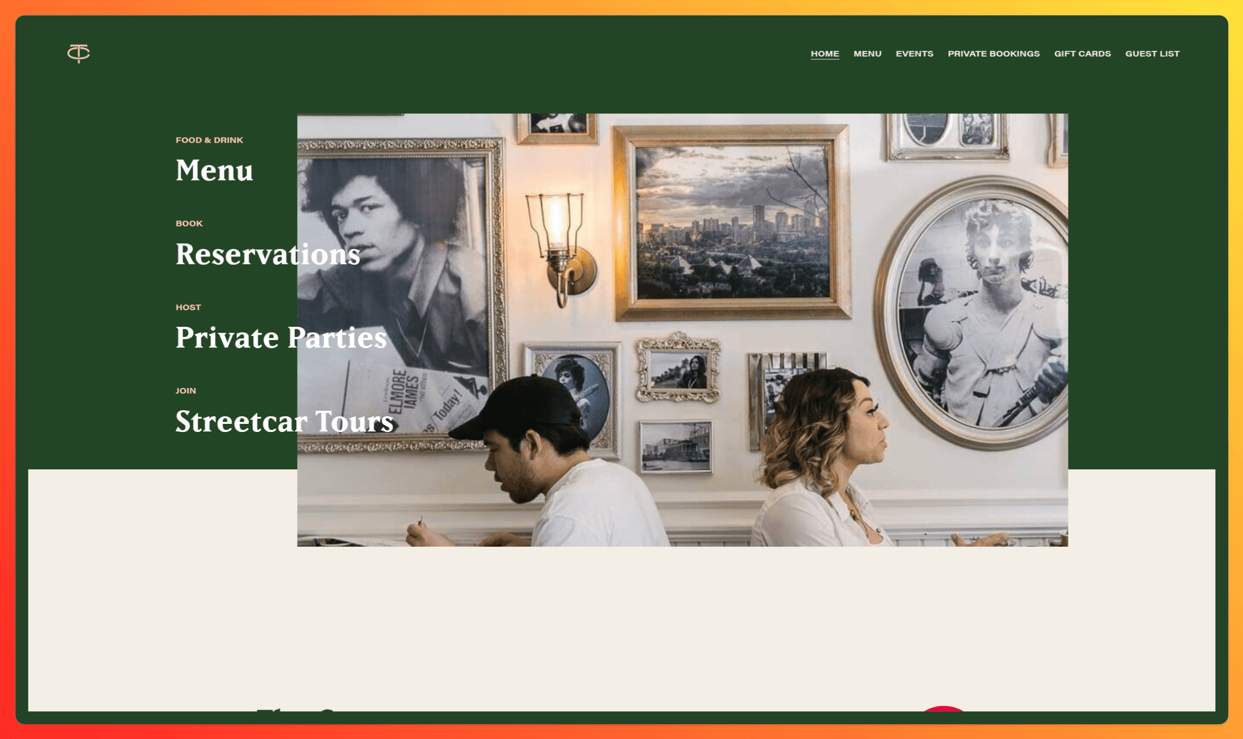
- The Common: This popular Edmonton restaurant chain has a website that's as stylish and inviting as their dining spaces. With mouthwatering food photography, easy online ordering, and a clean, minimalist design, their website perfectly captures their brand essence.
Check it out here.
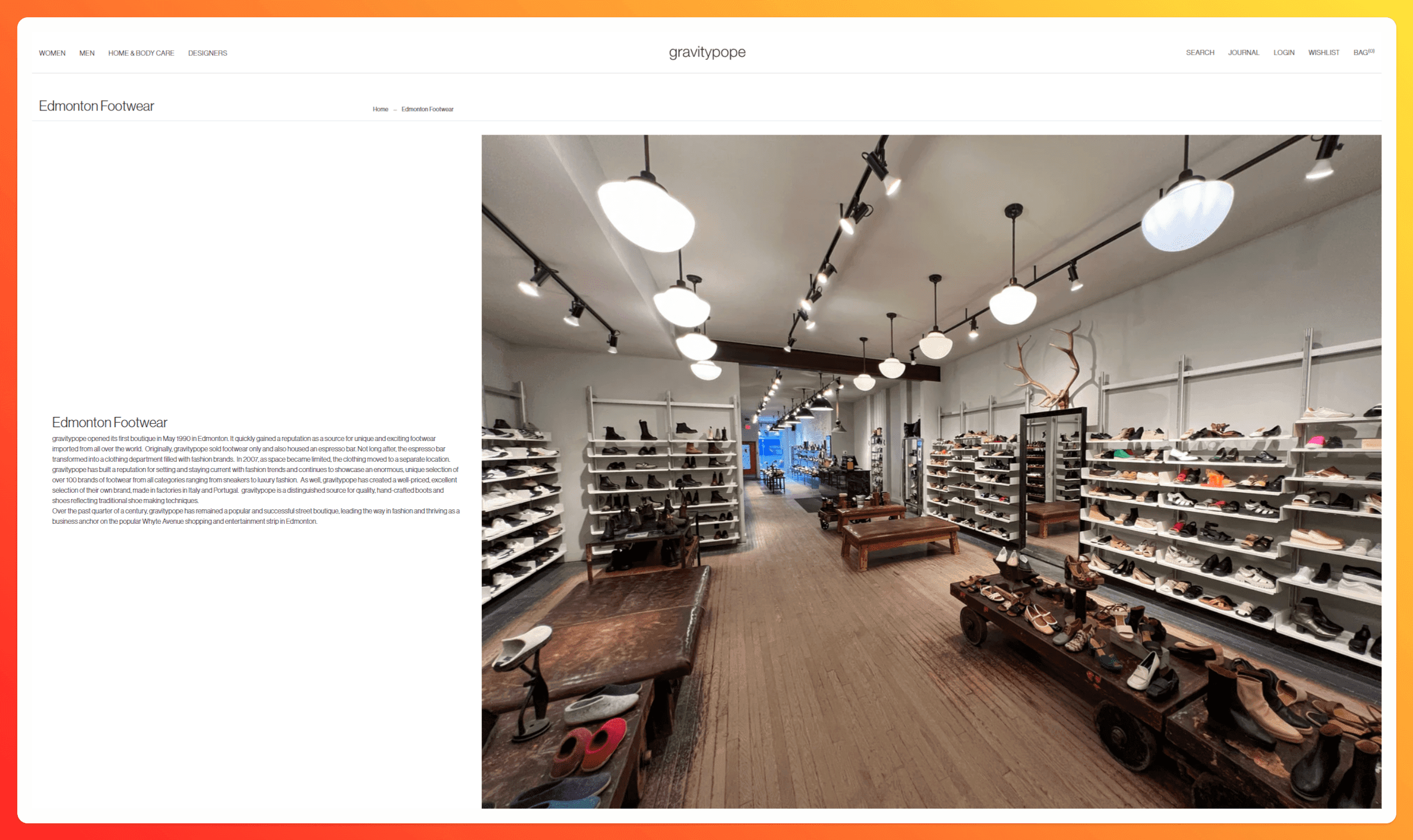
- Gravity Pope: This high-end footwear and clothing retailer has a website that's as fashion-forward as their merchandise. With stunning visuals, a user-friendly interface, and a seamless online shopping experience, they've created a digital experience that's both luxurious and accessible.
See it for yourself here.
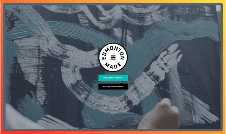
- Edmonton Made: A designer website that showcases small businesses in the Edmonton area that have done such a fantastic job of building their website
Explore their digital world here.
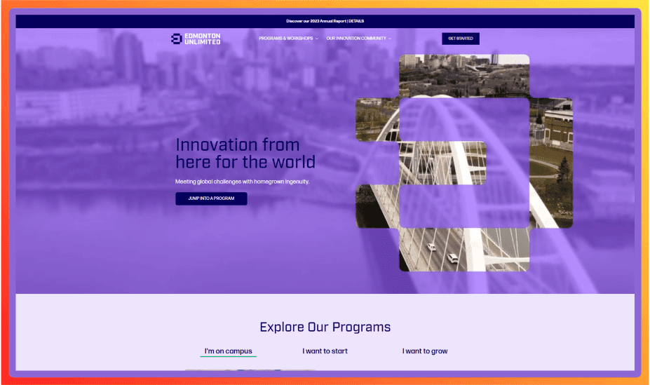
- Edmonton Unlimited: This organization supporting local entrepreneurs has a website that's as vibrant and innovative as the startup community it serves. With bold colours, engaging content, and a user-friendly layout, their website is a valuable resource for anyone looking to launch or grow a business in Edmonton.
Take a look here.
What do these websites have in common?
They all prioritize user experience, embrace clean and modern aesthetics, and effectively showcase their brand personality. They're proof that modern website design isn't just for big corporations – it's an essential tool for businesses of all sizes in Edmonton.
How to Get Started with Modern Website Design

Okay, so you're ready to take the plunge and modernize your website. But where do you even begin? Don't worry; I've got you covered.
DIY or delegate?
First things first, decide whether you want to tackle the website design yourself or hire a professional. If you're tech-savvy and have a knack for design, there are plenty of DIY website builders out there, like Wix, Squarespace, and WordPress.
These platforms offer user-friendly interfaces and pre-designed templates that make it easy to create a modern website without coding knowledge.
However, if you're short on time, lack design skills, or want a truly custom website, hiring a professional web designer is the way to go.
A skilled designer can bring your vision to life, ensuring your website is not only visually appealing but also optimized for performance and user experience.
Choosing the right platform
If you decide to go the DIY route, you'll need to choose a website platform that suits your needs. Here are a few popular options:
- WordPress: This open-source platform is highly customizable and offers a vast library of plugins and themes. It's a great choice for businesses that want complete control over their website's design and functionality.
- Wix: This drag-and-drop website builder is incredibly user-friendly and offers various templates for various industries. It's a good option for businesses that want a quick and easy way to create a modern website.
- Squarespace: Known for its sleek templates and beautiful designs, Squarespace is a popular choice for businesses that prioritize aesthetics. It's also a good option for those who want a website builder that's easy to use and manage.
Key Considerations for Edmonton Businesses
No matter which route you choose, there are a few key considerations for Edmonton businesses:
- Showcase your local pride: Consider incorporating Edmonton landmarks, imagery, or cultural elements into your website design to connect with your local audience.
- Cater to Edmonton's Diverse Demographics: Ensure your website is accessible and inclusive, catering to the diverse languages, cultures, and abilities of Edmonton's population.
- Highlight your unique value proposition: What sets your business apart from the competition? Make sure your website clearly communicates your unique strengths and offerings.
Creating a modern website is an investment in your business's future. By taking the time to plan, design, and optimize your online presence, you can attract new customers, build brand loyalty, and achieve your business goals in Edmonton's thriving market.
Final Thoughts
We've covered a lot of ground today, from the telltale signs of an outdated website to the key elements of modern design. Don't let yours hold you back and prevent you from attracting customers, build credibility, and drive growth.
Whether you choose to DIY or hire a professional, take the time to invest in a website that truly represents your brand and delivers an exceptional user experience.
And if you do want a professional service that can handle everything for you, from redesigning and updating your website, managing the content and blogs, or rebuilding it from the ground up, the team here at Ignite Web Design are here for you.
Based right here in Edmonton, CA, we understand that your website is an ongoing project, not a one-time task. We'll do everything to ensure you stay up-to-date with the latest design trends, keep your content fresh, and continually optimize your site for performance and user engagement.
Contact us to get started for free today.