How Edmonton SEO Specialists Use Color Psychology in Web Design to Get You More Clicks
by ,

Ever walked into a room and instantly felt… off?
Maybe the walls were a drab beige, or the lighting was harsh and cold. Maybe it's bland, grey, or clinically green, like a hospital in a horror movie. Even an overcast day can have the same effect.
Likewise, you've probably been in rooms, hotels, or venues where it looks amazing, and the place's vibe just feels spot on.
Wherever you go, these feelings stem from your brain reacting to colour (or lack thereof!).
And just like a physical space, your website's colour scheme sets the stage for the entire user experience. While subtle, it can make a big difference in how people perceive your brand and whether they want to do business with you.
We're talking about everything from page design to button colour.
If you're serious about making your Edmonton business stand out online (and I know you are!), mastering the psychology of colour in web design is non-negotiable.
And this guide has everything you need to know to get it just right for your business and website.
Let's go.
What is colour psychology?

Colour psychology is the study of how colour affects human behaviour and decision-making. It might sound a bit woo-woo to some, but there's actually a ton of science behind it.
The basics of color theory
Before we get into the emotions of colour, let's quickly recap some colour theory fundamentals.
Remember the colour wheel from elementary school art class? That's our starting point. It shows the relationships between different colours, from primary (red, yellow, blue) to secondary (green, orange, purple) and tertiary colours.
But there's more to colour than just the rainbow. You also need to consider:
- Hue: This is the pure colour itself, like a vibrant red or a calming blue.
- Saturation: Think of this as the intensity of a colour. A fully saturated colour is bold and vivid, while a desaturated colour appears more muted and grayed out.
- Value: This refers to how light or dark a colour is. Think of the difference between a pale pastel pink and a deep, rich maroon.
How colours evoke emotions
Now, for the fun part: emotions.
Different colours trigger different emotional responses in our brains.
For example, red is often associated with energy, passion, and excitement (think of a fiery red sports car or a bold red lipstick).
Blue, on the other hand, evokes feelings of trust, calmness, and security (that's why so many banks and financial institutions use blue in their branding).
These emotional associations aren't arbitrary. They're rooted in our biology, cultural experiences, and personal preferences.
Pretty cool, right?
Now, think about the businesses you interact with and how colour is used to create a certain way.

Think Coca-Cola.
That vibrant red practically screams energy and excitement, doesn't it?
Red is known to stimulate appetite and create a sense of urgency, perfect for encouraging impulse buys when you have a craving. And when you pair that red with McDonald's golden arches, you've got a recipe for grabbing attention and triggering cravings.
But it's not just about fast food. Consider these examples:
- Green: Whole Foods Market uses green to evoke feelings of health, freshness, and natural goodness.
- Purple: Cadbury's signature purple is associated with royalty, luxury, and indulgence.
- Black: Think of high-end brands like Chanel or Gucci. Black conveys sophistication, elegance, and exclusivity.
- Orange: Companies like Home Depot and Harley-Davidson use orange to project confidence, warmth, and a sense of adventure.
See how much colour impacts your perception of a brand?
Choosing the right colours for your website and branding can make all the difference in how customers feel about your business.
By strategically using colour on your website, you can influence how visitors feel and guide them toward taking specific actions.
What are the colour psychology associations and meanings?
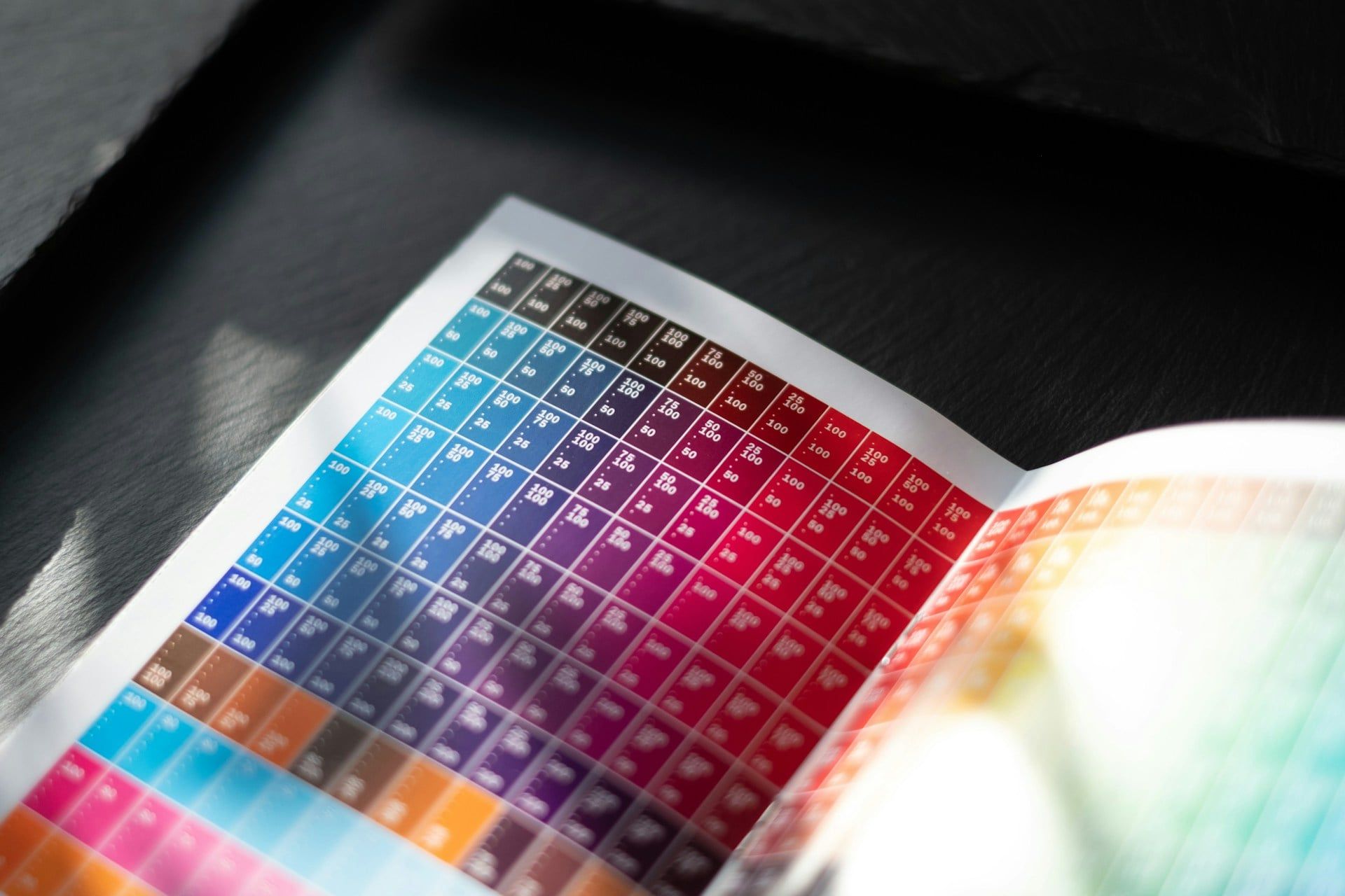
Each colour carries its own unique set of associations, influencing how people perceive your brand and interact with your content.
Here's a quick rundown of some common colour associations in Western cultures (we'll touch on cultural differences a bit later):
- Red: Bold and energetic, red grabs attention and evokes strong emotions like passion, excitement, and even urgency. Think of those flashy "Sale!" signs or that little red notification badge on your phone. Red can also stimulate appetite, which is why you see it used so often in restaurant branding (ever notice how many fast-food logos feature red?).
- Blue: Calm, cool, and collected, blue is the colour of trust and stability. It's often associated with security, peace, and reliability, making it a popular choice for financial institutions, healthcare providers, and tech companies. Think of brands like Facebook, IBM, and Ford.
- Green: Naturally, green brings to mind nature, growth, and harmony. It's often associated with health, sustainability, and prosperity. Think of companies like Whole Foods or John Deere. Green can also signify new beginnings and fresh starts, making it an excellent choice for businesses focused on innovation or eco-consciousness.
- Yellow: Cheerful and optimistic, yellow is the colour of sunshine and happiness. It can also stimulate creativity and mental activity. However, be careful not to overuse it, as too much yellow can be overwhelming and even cause anxiety.
- Purple: Historically associated with royalty and luxury, purple can also convey creativity, wisdom, and spirituality. Think of brands like Hallmark or Cadbury.
- Orange: A vibrant and playful colour, orange represents enthusiasm, warmth, and creativity. It can also stimulate appetite and encourage action. Think brands like Fanta or Nickelodeon.
- Black: Sophisticated and powerful, black is often associated with elegance, luxury, and authority. Think brands like Chanel or Gucci. It can also create a sense of mystery and intrigue.
- White: Clean, pure, and simple, white represents innocence, purity, and new beginnings. It's often used to create a sense of space and minimalism. Think brands like Apple or Tesla.
How to choose colours that match your brand personality
Choosing the right colours for your website is like dressing your brand for success. You want to make sure your colour palette aligns with your brand's personality and values.
For example, if you're a funky, creative agency in Edmonton (like, say, a video production company or a graphic design studio), you might opt for bold, vibrant colours like orange, yellow, and purple to showcase your energy and originality.
On the other hand, if you're a law firm or a financial advisor, you'll probably want to stick with more conservative colours like blue, gray, and black to convey trust and professionalism.
Take a look at some local Edmonton businesses and how they use colour.
For example, the Edmonton Oilers' website uses a bold orange and blue colour scheme, reflecting their energetic and powerful brand.
The Art Gallery of Alberta's website uses a more sophisticated black, white, and gray palette (with some very subtle green accents), conveying a sense of elegance and artistry.
By understanding the psychology behind each colour, you can create a website that looks great and effectively communicates your brand message and resonates with your target audience.
Cultural considerations in colour choice
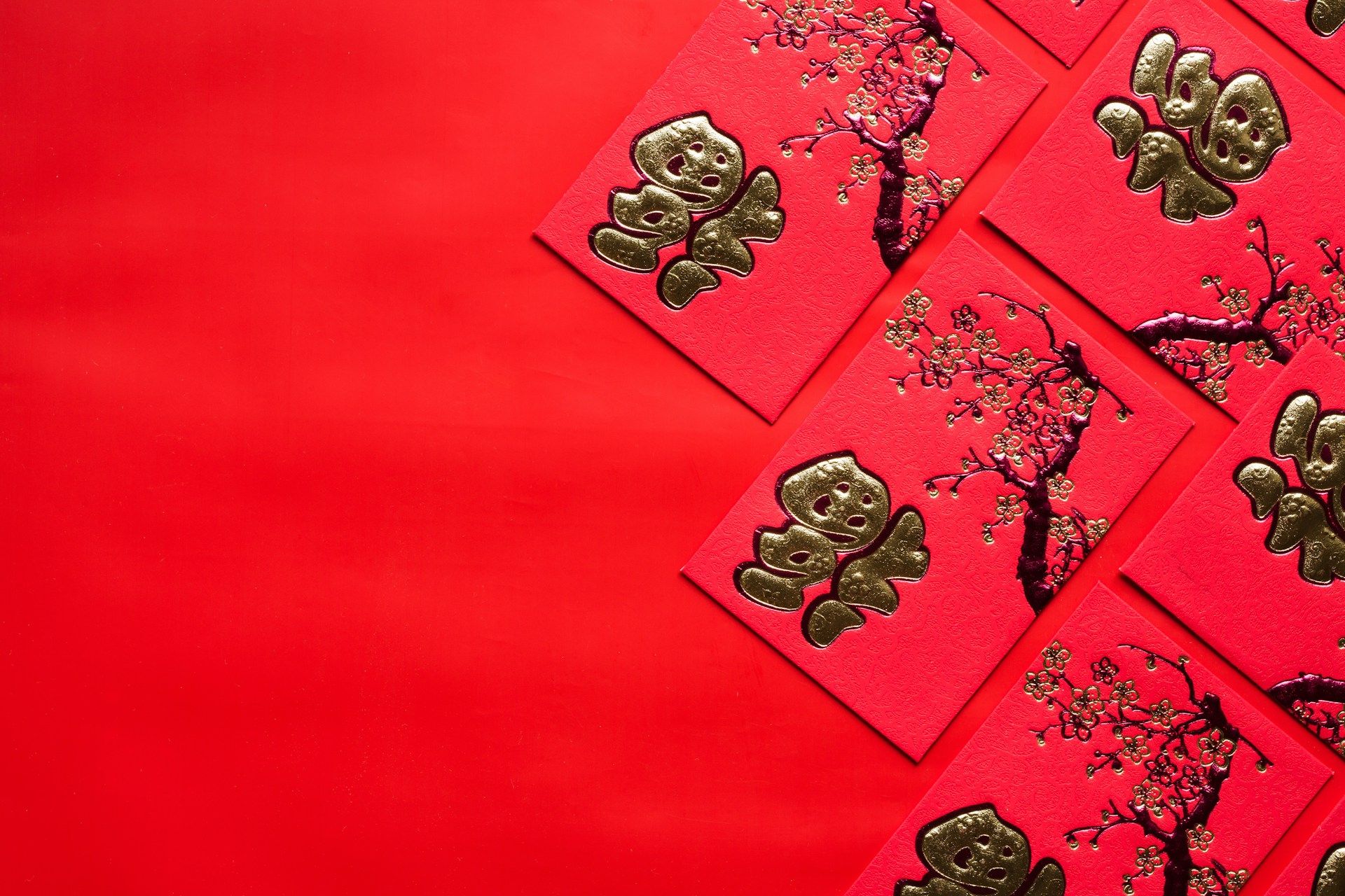
Hold up - before you go painting your entire website red because you want to evoke passion and drive sales, there's something crucial to consider: cultural context.
Remember, not everyone sees colour the same way. What evokes excitement in one culture might signify mourning in another.
Global perspectives on colour
While some colour associations are fairly universal (like blue representing calmness), others can vary significantly across different cultures.
For example, while white is often associated with purity and innocence in Western cultures, it can symbolize mourning and death in some Eastern cultures.
Similarly, red, which is often associated with passion and excitement in the West, can symbolize good luck and prosperity in many Asian cultures.
Adapting colour choices for diverse audiences
So, what does this mean for your Edmonton business? Well, it depends on your target audience.
If you primarily serve local customers, you can focus on colour associations that resonate with Western culture.
However, if you have a global audience or serve a diverse community within Edmonton, it's important to be mindful of these cultural nuances.
Here are a few tips:
- Do your research: If you're targeting specific cultural groups, take the time to learn about their colour associations.
- Consider the context: The meaning of a colour can also change depending on how it's used. For example, red might be a strong choice for a call-to-action button on a website promoting a fitness class, but it might not be the best choice for a website promoting a meditation retreat.
- Use colour strategically: Don't just rely on colour alone to convey your message. Use other visual cues, like imagery and typography, to reinforce your brand identity and create a welcoming experience for all visitors.
By being sensitive to cultural differences in colour perception, you can ensure that your website is both visually appealing and culturally appropriate for your target audience.
The impact of colour on website usability

Here's the thing: colour isn't just about aesthetics or making your website look pretty. It plays a crucial role in usability, too. In other words, colour can make or break how easy it is for visitors to navigate your site, find information, and, ultimately, take action.
Colour and accessibility
First and foremost, colour is a key factor in website accessibility. We need to make sure our websites are usable for everyone, including people with visual impairments.
- Colour contrast: This is HUGE. People with low vision often rely on sufficient contrast between text and background colours to read content effectively. Using a tool like WebAIM's Color Contrast Checker can help you ensure your website meets accessibility standards (WCAG). Trust me, it's a lifesaver!
- Colorblind-friendly design: Did you know that approximately 1 in 12 men and 1 in 200 women have some form of colorblindness? That's a significant chunk of your potential audience. When designing your website, avoid using colour alone to convey information. For example, if you're using a colour-coded chart, include patterns or labels to make it understandable for everyone.
Colour and User Experience (UX)
Beyond accessibility, colour can significantly impact the overall user experience (UX) of your website.
- Guiding user attention: Think of colour as a visual cue. You can use it to highlight important elements, guide users through your site, and direct their attention to specific areas. For example, a bright, contrasting colour can make your call-to-action buttons pop, encouraging clicks and conversions.
- Creating visual hierarchy: Color can help you establish a clear visual hierarchy on your website. Use different colours to differentiate headings, subheadings, and body text, making it easier for users to scan and understand your content.
By considering colour's impact on accessibility and UX, you can create a website that is not only visually appealing but also user-friendly and inclusive for all visitors. Remember, a website that's easy to use is a website that converts!
What are the best practices for using colour in web design?
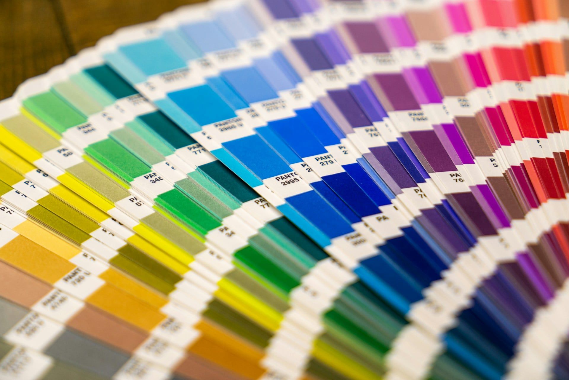
Alright, by now, you're probably thinking, "Okay, I get it! Colour is important. But how do I actually use it effectively on my website?"
Here are some tried-and-true best practices to help you create a website that's both visually stunning and strategically sound.
Creating effective colour palettes
Choosing the right colour palette is like laying the foundation for your website's design. It sets the tone, evokes emotions, and guides user behaviour. Here's how to nail it:
- The 60-30-10 rule: This classic design principle suggests using three main colours in a 60-30-10 ratio. Your dominant colour (60%) should be the most prominent, followed by a secondary colour (30%), and then an accent colour (10%) for highlights and calls to action. This creates balance and visual interest.
- Colour psychology as your guide: Remember all that stuff we talked about with colour associations? Put it to work. Choose colours that align with your brand personality and the emotions you want to evoke in your audience. For example, if you're a wellness brand in Edmonton, you might opt for calming blues and greens with a pop of energizing yellow.
- Don't reinvent the wheel (unless you want to): There are tons of amazing tools out there to help you create stunning colour palettes. Some of my favorites include Adobe Color, Coolors, and Paletton. These tools offer pre-made palettes, allow you to generate custom schemes, and even let you explore colour combinations from inspiring images.
Colour and Call to Actions (CTAs)
Your call to actions (CTAs) are the heart of your website. They're the buttons, links, and forms that encourage visitors to take the next step, whether it's making a purchase, signing up for a newsletter, or requesting a consultation.
Colour plays a HUGE role in making your CTAs stand out.
- Contrast is key: Use a contrasting colour for your CTA buttons to make them pop against the background. For example, if your website has a predominantly blue theme, a bright orange or yellow button will really grab attention.
- A/B testing: Don't just guess. A/B test different CTA button colours to see which ones perform best. You might be surprised at the results. Even subtle changes in hue or saturation can significantly impact your conversion rates.
Colour and Branding Consistency
Consistency is key to building a strong brand identity.
Your website's colour scheme should be consistent with your logo, marketing materials, social media presence, and any other visual touchpoints. This creates a cohesive and recognizable brand experience for your audience.
By following these best practices, you can harness the power of colour to create a website that's not only visually appealing but also strategically designed to achieve your business goals.
Colour Palette Inspiration and Tools
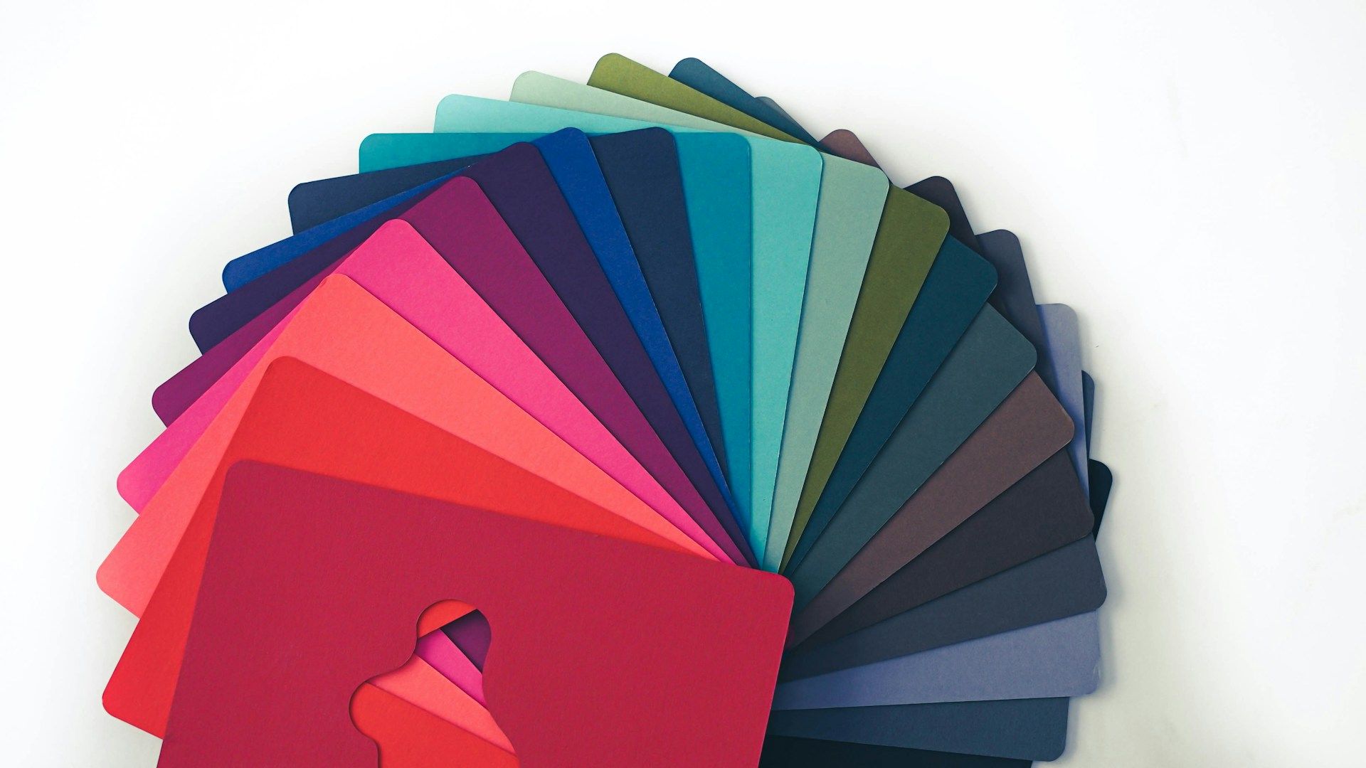
Feeling overwhelmed by the sheer number of colour choices out there? I get it. Sometimes it feels like there are a million shades of blue alone.
But don't worry, you don't have to be a design whiz to create a stunning colour palette for your website. There are tons of resources available to help you find inspiration and get those creative juices flowing.
Websites and resources for color inspiration
Need a little nudge in the right direction? Check out these awesome websites:
- Coolors: This website is a playground for colour lovers. It generates beautiful colour palettes and lets you explore trending combinations. You can even lock in colours you like and let the generator suggest complementary hues.
- Adobe Color: Created by the design software giants, Adobe Color is a powerful tool for exploring and creating colour palettes. It lets you create schemes based on colour theory rules, explore gradients, and even extract palettes from images.
- Designspiration: This platform is a treasure trove of visual inspiration, including a vast collection of colour palettes. You can search by colour, keyword, or even "mood" to find palettes that resonate with your brand.
And if you want to take a more hands-on approach, these tools can help:
- Khroma: This AI-powered tool learns your colour preferences and generates personalized palettes that you'll actually love.
- ColorSpace: Input a single colour, and this tool will generate a range of palettes with different moods and styles.
- Muzli Colors: Not only does this tool generate palettes, but it also provides UI kits and lets you preview how your palette will look in a website layout.
Don't be afraid to experiment and play around with different tools and resources until you find a colour palette that perfectly captures the essence of your brand.
And remember, if you're ever feeling stuck, you can always reach out to a professional web designer in Edmonton (like yours truly!) for expert guidance.